|
|
LATEX documents are all plain-text files. Originally this meant just the 95 printable characters of the American Standard Code for Information Interchange (ASCII) — see Table C.1 for this — but now it more commonly means ‘printable characters’ in whatever character set is native to your language and culture. Most Roman-based languages are covered by ISO-8859-1 (Western Latin–1), ISO-8859-2 (Western Latin–2) and ISO-8859-15 (Western Latin plus the Euro sign), but there are many others, all now included in Unicode (ISO 10646) which represents all known written human languages.
These are international standards which work everywhere: you should avoid using obsolete manufacturers' proprietary character sets like Microsoft Windows–1252, Apple Macintosh Roman–8, Big5 (Chinese-Japanese-Korean) and the like because they may make your documents unusable on other systems. Most modern computer systems now use Unicode as standard for all plaintext files.
If you stick to Unicode, you can edit your LATEX files with any editor, and transfer them to any other computer system running LATEX and they will format exactly the same. Because they are plain text they cannot corrupt your system, and they cannot be used for hiding or transporting virus infections like binary (non-plaintext) wordprocessor files can. Everything you can see is in the file and everything in the file is there for you to see: there is nothing hidden or secret and there are no manufacturers' proprietary ‘gotchas’ like suddenly going out of date with a new version.
So if LATEX files are all plaintext, how does LATEX know how to format them? The answer is it uses markup: a system of labels which tells LATEX what's what. The LATEX stylesheets recognise the labels and know how to format them, so you don't usually need to add formatting by hand unless you want to do some thing special or out of the ordinary.
 2.1 Markup
In a LATEX document, you type your text along with markup which identifies the relevant parts of your document by name, for example ‘title’, ‘section’, ‘figure’, etc.. LATEX does all the formatting for you automatically, using the markup to guide its internal rules and external stylesheets for typesetting.
LATEX markup is all in (American) English, with a few abbreviations for long words to minimise typing, although you normally use a menu or toolbar button, so actually typing it is rare for the beginner.
|

You do not need to format any of your text in your editor, because LATEX does the formatting all by itself when it typesets. You can of course regularise or neaten its appearance in your editor for your own ease of editing (for example, keeping each item in a list on a separate line), but this is not required.
You will often hear LATEX markup referred to as ‘commands’ or sometimes ‘control sequences’ (the proper TEXnical term for them). For all practical purposes these terms all mean the same thing.
2.2 Quick start for the impatient
If you already know all this stuff about editors and plain-text files and running programs, and you know your system is already correctly installed (including your editor), you'd probably like to type something in and see LATEX do its job.
If you don't know this stuff yet, then still do this section now, and treat it as part of the learning experience.
- Install LATEX
See Chapter 1.
- Create a new, empty document
Open your editor and click on New Document.
Delete any template material it inserts, so that your document is completely empty.
- Copy the example
Copy and paste the text from Figure 2.1. Make sure you get all of it, and don't change anything.
- Save the document
Save the document as
quickstart.tex - Typeset the document
TEXnicCenter users must pick the
TeX -->
                        	      PDF
option in the toolbar drop-down menu first!Click on the toolbar item for your system as indicated by the black cursor in Figure 2.2.
- Preview the typesetting
Click on the toolbar item (next to the icon) if this does not open automatically for you.
- Print it
Click on the Print toolbar icon in the viewer.
If you encounter any errors, it means you do need to read the rest of this chapter after all!


2.3 LATEX commands
LATEX commands all begin with a backslash (\)
and consist of lowercase letters only.
Do not confuse the backslash with the forward slash
(/). They are two different characters. The
forward slash is used on the Web and on Unix-based systems
(including Macs and GNU/Linux) to separate directory names and
filenames. The backslash is used for the same purpose in the
Microsoft Windows file system, but you must
always use the forward slash in folder and
file names in LATEX, even if you use Microsoft Windows.
2.3.1 Simple commands
Simple commands are just the command name on its own, after the backslash, for example:
\tableofcontents
This example is an instruction to LATEX to insert the Table of Contents at that point. You would usually use this in a book or report (or perhaps a very long article) somewhere close to the beginning, normally after the title page but before the Preface or Introduction. You don't have to do anything else. Provided that you have used the sectioning commands described in section 3.5, all the formatting and numbering for the Table of Contents is completely automatic.
Simple one-word commands like
\tableofcontents must be separated from
any following text with white-space. This means a normal
space, or a newline (linebreak) or a TAB character. For
example either of these two forms will work:
\tableofcontents     Thanks to Aunt Mabel for all her
help with this book.
\tableofcontents
Thanks to Aunt Mabel for all her help with this book.
If you forget the white-space, as in the following
example, LATEX will treat everything up to the next space
as a command, and end up with what it thinks is a command
called \tableofcontentsThanks.
There's no such command, of course, so LATEX will
complain by displaying an error message (see section 4.2.3.2).
\tableofcontentsThanks to Aunt Mabel for all her help
with this book.
LATEX swallows any white-space which follows a command ending in a letter. It does this automatically, so you don't get unwanted extra space in your typeset output, but it does mean that any simple command which ends in a letter and has no arguments in curly braces (see below) must be followed by white-space before normal text starts again, to keep it separate from the text.
2.3.2 Commands with arguments
Many LATEX commands are followed by one or more arguments, meaning information to be acted upon. Here are two examples, a chapter title (see section 3.5) and a cross-reference label (see section 7.4.1):
\chapter{Poetic Form}
\label{pform}
The shape of poetry when written or printed
distinguishes it from prose.
Such arguments always go in
{curly
braces} like
those shown above. Be careful not to confuse the
curly braces on your keyboard with (round) parentheses,
[square] brackets, or 〈angle〉 brackets. They
are all different and they mean different things.
With commands that take arguments you do not need to use extra white-space after the command, because the argument in curly braces will keep it separate from any normal text which comes after it. The following example is therefore exactly equivalent to the earlier one above.
\chapter{Poetic Form}\label{pform}The shape of poetry
when written or printed distinguishes it from prose.
2.3.3 White-space in LATEX
In LATEX documents, all multiple spaces and TAB characters are treated as if they were a single space during typesetting. All multiple newlines (linebreaks) are treated as if they were a single newline. LATEX does its own spacing and alignment using the commands you give it and the layout in the stylesheet, so you have extremely precise control. You are therefore free to use extra white-space in your editor for optical ease and convenience when editing.
The following is therefore exactly equivalent to the examples in the preceding section (although unusual!):
\chapter        {Poetic
          Form}                      \label
            {pform}

The shape of           poetry when written or printed
distinguishes it from              prose.
That is, it will get typeset exactly the same. Try it.
Why would you want odd spacing (or none)? The answer is usually never, but a lot of LATEX is created by computer programs from other systems such as web scripts, XML documents, or databases, and it maks life easier if you don't have to worry about the odd space or two creeping in here and there in normal text: it simply won't have any effect. It also means that you don't have to worry about extra linebreaks between sections or paragraphs, or tabbing in lists of items if you want to use them to make your text easier to edit.
2.4 Special characters
There are ten keyboard characters which have special meanings to LATEX, and cannot be used on their own except for the purposes shown in Table 2.1.
| Key | Meaning | If you need the actual character itself, type: |
Character |
|---|---|---|---|
| \ | The command character | \textbackslash |
\ |
| $ | Math typesetting delimiter | \$ |
$ |
| % | The comment character | \% |
% |
| ^ | Math superscript character | \^ |
^ |
| & | Tabular column separator | \& |
& |
| _ | Math subscript character | \_ |
_ |
| ˜ | Non-breaking space | \˜ |
˜ |
| # | Macro parameter symbol | \# |
# |
| { | Argument start delimiter | $\{$ |
{ |
| } | Argument end delimiter | $\}$ |
} |
These characters were deliberately chosen, either because they are rare in normal text, or (in the case of $, #, &, and %) they have an established special meaning on computers as metacharacters (characters standing as symbols for something else).
2.4.1 Using the special characters
We have already seen (the first paragraph in section 2.3) how to use the backslash to start a command, and curly braces to delimit an argument. The remaining special characters are:
- $
This has a special mathematical meaning in TEX, so if you want to print $35.99 you must type
\$35.99- %
The comment character makes LATEX ignore the remainder of the line in your document, so you can see it in your editor, but it will never get typeset. For example:
Today's price per kilo is €22.70
% get Mike to update this daily
If you want to print 45% you must type
45\%.As with all comments in documents, whether LATEX or just a wordprocessor, don't forget to remove them before sending the original document source to someone else!
and must never be allowed authority to create a charge on the department again. % and fire those idiots down in Finance!- ^
The caret sign in mathematics lets you type
\(E=mc^2\)to get E=mc2. If you need the circumflex accent on a letter like â, just type it normally or use the symbolic notation\^a(see section 2.6).- &
The ampersand is used in LATEX tables to separate the columns (see section 6.3). If you want to print AT&T you must type
AT\&T.- _
The underscore in mathematics lets you type
\(r_2\)for r2. If you want to underline text (extremely rare in typesetting) see the last paragraph in section 8.2.3. If you need an underscore character as part of a computer name like SUB_TOTAL, use the\verbcommand (see section 6.6).- ˜
The tilde in LATEX prints as a normal space, but prevents a linebreak ever occurring at that point. It's often used between a person's initials and their surname, eg
Prof
                              		  D.E.~Knuth
where a linebreak would make it harder to read.- #
If you want a hash mark (the octothorpe or American ‘pound’ [weight] or ‘number’ sign) you must type
\#. For a pound (sterling) sign (£, now nearly obsolete except in the UK and some of its former dependencies), use your £ key or type\textsterling.
While we're on the subject of money, the
official sans-serif Euro sign € needs the
marvosym package and is done with the
\EUR command (see section 5.1 for details of how to use LATEX
packages). Not every font has a Euro character, though, and
the default € is based on a letter C.
However, a slightly unusual but interesting serif
Euro sign €
is in the textcomp package using the
\texteuro command when using the Computer
Modern typeface (see for
details of switching typefaces in mid-text).
2.5 Quotation marks
If you are using UTF-8 as your input encoding and file format, and the T1 font encodings, you can use your operating system's normal open-quote and close-quote characters. See for how to.
Do not use the unidirectional typewriter keyboard ' (apostrophe) or " (quotes) key for opening quotes. Correct typographic quotes are got with the ` key (grave-accent or ‘backtick’) for the opening quote, and the ' (apostrophe) key for the closing quote, doubled if you want double quotes:
He said, ``I'm just going out.''He said, ‘‘I'm just going out.’’
This ensures you get real left-hand (opening) and right-hand (closing) ‘curly quotes’, usually shaped like tiny 66 and 99 characters, or as symmetrically-balanced strokes in sans-serif typefaces.
If you are using Emacs as your
editor, the " key is
specially programmed in LATEX-mode to think for itself and
produce correct `` and
'' characters automatically. This is one
occasion when you can use the
" key for an open-quote,
because it will be interpreted correctly.
If you are reading this in a browser, or if you have typeset the document yourself using different fonts, it may not show you real quotes (some old browser fonts are defective) and the
\thinspacebelow may be too wide. Download the typeset (PDF) version of this document to see the real effect, and switch to a browser with better font-handling.
When typing one quotation inside another,
there is a special command \thinspace which
provides just enough separation between double and single
quotes (a normal space is too much and could allow an unwanted
linebreak):
He said, `Her answer was ``never''\thinspace'.He said, ‘Her answer was ‘‘never’’ ’.
2.6 Accents
For accented letters in western European languages1 or other Latin-alphabet character sets just use the accented keys on your keyboard — if you have the right ones. You must also tell LATEX what character repertoire (‘input encoding’) you are using. You specify this by using the inputenc package in your preamble with the relevant option. For example, to tell LATEX you will be using ISO Latin–1 characters, use:
\usepackage[latin1]{inputenc}
However, with most modern systems, Unicode will let you insert almost any letter or symbol from any writing system, and I recommend the following preamble for all documents:
\usepackage{ucs}
\usepackage[utf8x]{inputenc}
\usepackage[T1]{fontenc}
For language-specific hyphenation you will need the babel (see section 2.7.6), and for non-Latin typefaces you will need the relevant font packages and typefaces (see ).
|
If you don't have accented letter keys on your
keyboard, or you can't find the codes to type, or if you need
additional accents or symbols which are not in any of the
keyboard tables, you can use the symbolic notation in Table 2.1. In fact this can be used to put
any accent over any letter: if you particularly want a
g˜, for example, you can have one with the command
\˜g (and Welsh
users can get a ŵ with
\^w).
If you use this symbolic method only, you do not need to use the inputenc package described above.
Before the days of keyboards and screens with their own real accented characters, the symbolic notation was the only way to get accents, so you may come across a lot of older documents (and users!) using this method all the time: it does have the advantage in portability that the LATEX file remains plain ASCII, which will work on all machines everywhere, regardless of their internal encoding, and even with very old TEX installations.2
| Accent | Example | Characters to type |
|---|---|---|
| Acute (fada) | é | \'e |
| Grave | è | \`e |
| Circumflex | ê | \^e |
| Umlaut or diæresis | ë | \"e |
| Tilde | ñ | \~n |
| Macron | ō | \=o |
| Bar-under | o | \b o |
| Dot-over (séıṁıú) | ṁ | \.m |
| Dot-under | ṣ | \d s |
| Breve | ŭ | \u u |
| Háček (caron) | ŭ | \v u |
| Long umlaut | ő | \H o |
| Tie-after |  |
\t oo |
| Cedilla | ç, Ç | \c c, \c C |
| O-E ligature | œ, Œ | \oe,
\OE |
| A-E ligature | æ, Æ | \ae,
\AE |
| A-ring | å, Å | \aa,
\AA |
| O-slash | ø, Ø | \o,
\O |
| Soft-l | ł, Ł | \l,
\L |
| Ess-zet (scharfes-S) | ß | \ss |
Irish and Turkish dotless-ı is done with the
special command \i, so an í
(which is normally typed with í)
requires \'\i if you need to type it in the
long format, followed by a backslash-space or dummy pair of
curly braces if it comes at the end of a word and there is no
punctuation, because of the rule that LATEX control
sequences which end in a letter (see the text in section 2.3.1) always absorb any following space. So
what you might see as Rí
Teamhraċ has to be R\'\i\
Tea\.mra\.c when typed in full (there are not
usually any keyboard keys for the dotless-ı or the
lenited characters). A similar rule applies to dotless-j and to
uppercase Í.
2.7 Dimensions, hyphenation, justification, and breaking
LATEX's internal measurement system is extremely accurate. The underlying TEX engine conducts all its business in units smaller than the wavelength of visible light, so if you ask for 15mm space, that's what you'll get — within the limitations of your screen or printer, of course. Most screens cannot show dimensions of less than 1/96″ without resorting to magnification or scaling; and on printers, even at 600dpi, fine oblique lines or curves can still sometimes be seen to stagger the dots.
At the same time, many dimensions in LATEX's preprogrammed formatting are specially set up to be flexible: so much space, plus or minus certain limits to allow the system to make its own adjustments to accommodate variations like overlong lines, unevenly-sized images, and non-uniform spacing around headings.
TEX uses a very sophisticated justification algorithm to achieve a smooth, even texture to normal paragraph text by justifying a whole paragraph at a time, quite unlike the line-by-line approach used in wordprocessors and DTP syetems.
Occasionally, however, you will need to hand-correct an unusual word-break or line-break, and there are facilities for doing this on individual occasions as well as automating it for use throughout a document.
2.7.1 Specifying size units
Most people in printing and publishing habitually use points, picas and ems. Many designers use cm and mm. Many English-language speakers still use inches. You can specify lengths in LATEX in any of these units, plus some others (see Table 2.1).
| Unit | Size |
|---|---|
| Printers' fixed measures | |
| pt | Anglo-American standard points (72.27 to the inch) |
| pc | pica ems (12pt) |
| bp | Adobe ‘big’ points (72 to the inch) |
| sp | TEX ‘scaled’ points (65,536 to the pt) |
| dd | Didot (European standard) points (67.54 to the inch) |
| cc | Ciceros (European pica ems, 12dd) |
| Printers' relative measures | |
| em | ems of the current point size (historically the width of a letter ‘M’ but see below) |
| ex | x-height of the current font (height of letter ‘x’) |
| Other measures | |
| cm | centimeters (2.54 to the inch) |
| mm | millimeters (25.4 to the inch) |
| in | inches |
The em can cause beginners some puzzlement because it's based on the ‘point size’ of the type, which is itself misleading. The point size refers to the depth of the metal body on which foundry type was cast in the days of metal typesetting, not the printed height of the letters themselves. Thus the letter-size of 10pt type in one typeface can be radically different from 10pt type in another (look at the table in section 8.2, where all the examples are 10pt). An em is the height of the type-body in a specific size, so 1em of 10pt type is 10pt and 1em of 24pt type is 24pt.
An old name for a 1em space is a
‘quad’, and LATEX has a command
\quad for leaving exactly that much
horizontal space. A special name is given to the 12pt em, a
‘pica’ em, as it has become a fixed
measure in its own right.
If you are working with other DTP users, watch out for those who think that Adobe points (bp) are the only ones. The difference between an Adobe big-point and the standard point is only .27pt per inch, but in 10″ of text (a full page of A4) that's 2.7pt, which is nearly 1mm, enough to be clearly visible if you're trying to align one sample with another.
2.7.2 Hyphenation
LATEX hyphenates automatically according to the
language you use (see section 2.7.6). To specify
different breakpoints for an individual word, you can insert
soft-hyphens (discretionary hyphens, done with
\-) wherever you need them, for
example:
When in Mexico, we visited Popoca\-tépetl by helicopter.
To specify hyphenation points for all occurrences of a
word in the document, use the \hyphenation
command in your preamble (see the panel ‘The Preamble’ in section 3.4)
with one or more words as patterns in its argument,
separated by spaces. This will even let you break
‘helico-
pter’ correctly. In this command you use
normal hyphens in the pattern, not soft-hyphens.
\hyphenation{helico-pter Popoca-tépetl im-mer-sion}
If you have frequent hyphenation problems with long, unusual, or technical words, ask an expert about changing the value of \spaceskip, which controls the flexibility of the space between words. This is not something you would normally want to do without advice, as it can change the appearance of your document quite significantly.
If you are using a lot of unbreakable text (see the next section and also section 6.6.1) it may also cause justification problems. One possible solution to this is shown in section 9.3.
2.7.3 Unbreakable text
This is the opposite of discretionary hyphenation. To
force LATEX to treat a word as unbreakable, use the
\mbox command:
\mbox{pneumonoultramicroscopicsilicovolcanoconiosis}.
This may have undesirable results, however, if
you change margins or the width of the text:
pneumonoultramicroscopicsilicovolcanoconiosis...
To tie two words together with an unbreakable
space (hard space), use a tilde (~)
instead of the space (see the item ‘˜’ in section 2.4.1). This
will print as a normal space but LATEX will never break
the line at that point. You should make this standard typing
practice for things like people's initials followed by
their surname, as in Prof. D.E. Knuth:
Prof.\ D.E.~Knuth.
E. Knuth broken over a line-end.
2.7.4 Dashes
For a long dash — what printers call an
‘em rule’ like this — use three
hyphens typed together, like~--- this,
and bind them to the preceding word with a tilde to avoid
the line being broken before the dash. It's also common
to see the dash printed without spaces—like that: the
difference is purely æsthetic.
Never use a single hyphen for this
purpose.
Between digits like page ranges (35–47), it is
normal to use the short dash (what printers call an en-rule)
which you get by typing two hyphens together, as in
35--47. If you want a minus sign, use
math mode (section 2.8).
Never
use a single hyphen for either of these purposes.
2.7.5 Justification
The default mode for typesetting in LATEX is justified (two parallel margins, with word-spacing adjusted automatically for the best optical fit). In justifying, LATEX will never add space between letters, only between words. The soul package can be used if you need letter-spacing, but this is best left to the expert.
There are two commands
\raggedright and
\raggedleft which typeset with only one
margin aligned. Ragged-right has the text ranged (aligned)
on the left, and ragged-left has it aligned on the right.
They can be used inside a group (see the panel ‘Grouping’ in section 8.2.2) to confine their action to a part of
your text, or put in the Preamble if you want the whole
document done that way.
These modes also exist as ‘environments’ (see the last paragraph in section 3.2) called raggedright and raggedleft which are more convenient when applying this formatting to a whole paragraph or more, like this one.
\begin{raggedleft}
These modes also exist as environments called raggedright
and raggedleft which is more convenient when applying this
formatting to a whole paragraph or more, like this one.
\end{raggedleft}
Ragged setting turns off hyphenation. There is a package ragged2e which retains hyphenation in ragged setting, useful when you have a lot of long words.
To centre text, use the \centering
command in a group, or use the center
environment. Be careful when centering headings or other
display-size material, and add forced linebreaks where
needed (\\) to make the linebreaking make
sense.
The King AndI
2.7.6 Languages
LATEX can typeset in the native manner for several dozen languages. This affects hyphenation, word-spacing, indentation, and the names of the parts of documents displayed in headings (but not the commands used to produce them).
Most distributions of LATEX come with US English and one or more other languages installed by default, but it is easy to add the babel package and specify any of the supported languages or variants, for example:
\usepackage[english,german,frenchb]{babel}
...
\selectlanguage{german}
Changing the language with babel automatically changes the names of the structural units and identifiers like ‘Abstract’, ‘Index’, etc. to their translated version. For example, using French as above, chapters will start with ‘Chapitre’. The babel package also sets the hyphenation patterns provided your version of LATEX has them precompiled (see the start of your log files for a list). For other languages you need to set the hyphenation separately (outside the scope of this book).
2.8 Mathematics
As explained in the text in the Preface, TEX was originally written to automate the typesetting of books containing mathematics. The careful reader will already have noticed that mathematics is typeset differently from normal text, which is why it has to be treated specially. This document does not cover mathematical typesetting, which is explained in detail in many other books and Web pages, so all we will cover here is the existence of the math mode commands, and some characters which have special meaning, so they don't trip you up elsewhere.
In addition to the 10 special characters listed in section 2.4, there are three more characters which only have any meaning inside mathematics mode:
| Key | Meaning |
|---|---|
| | | Vertical bar |
| < | Less-than |
| > | Greater-than |
If you type any of these in normal text (ie outside math
mode), you will get very weird things happening and lots of
error messages. If you need to print these characters, you
must type them using math mode, or use
their symbolic names from the textcomp
package (\textbrokenbar,
\textlangle, and
\textrangle).
The hyphen also has an extra meaning in math mode: it typesets as a minus sign, so if you want to write about negative numbers you need to type the number in math mode so the minus sign and the spacing come out right.
To use math mode inline (within a paragraph), enclose your math
expression in \( and \)
commands. You can get the much-quoted equation
E=mc2 by typing
\(E=mc^2\), and to get a temperature like
−30° you need to type
\(-30\)°.3
To typeset a math expression as ‘displayed
math’ (centered between paragraphs), enclose it
in the commands \[ and
\].4
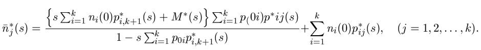
\[\bar n^*_j(s)=\frac{\left\{s\sum_{i=1}^k
n_i(0)p^*{i,k+1}(s)+M^*(s)\right\}\sum_{i=1}^k
p_{0i}p^*{ij}(s)}{1-s\sum_{i=1}^kp_{0i}p^*_{i,
k+1}(s)}+\sum_{i=1}^kn_i(0)p^*_{ij}(s)[j=
1,2,\dots,k].\]
Displayed equations can be auto-numbered with the
equation environment instead of the
\[ and \] commands.
- Bear in mind that the degree symbol is a non-ASCII character, so you must specify
what input encoding you are using if you want to type it:
see the example of the inputenc
package in section 2.6. If you don't
want to use non-ASCII characters
(or if you are using a system which cannot generate them),
you can use the command
\textdegreeto get the degree sign. - You will also see dollar signs used for math mode.
This is quite common but deprecated: it's what plain
TEX used in the days before LATEX, and the habit got
ingrained in many mathematicians. It still works as a
convenient shorthand like
$x=y$, as do double-dollars for display-mode math like$$E=mc^2$$, but they are only mentioned here to warn readers seeing them in other authors' work that\(...\)and\[...\]are the proper LATEX commands.


