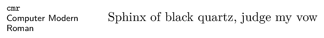
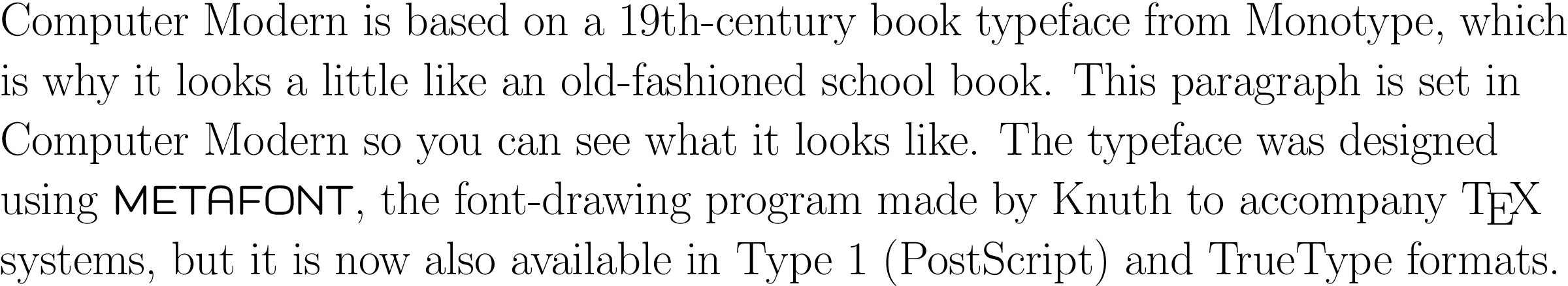
The default typeface in LATEX is Computer Modern (CM). This typeface was
created by Knuth for use with TEX. It is based on a
Victorian book typeface, Monotype Series 8, because he
designed TEX originally for typesetting books. Because it is
one of the very few book typefaces with a comprehensive set of
mathematical fonts, it has remained the default, rather than
the variations on Times that you find in wordprocessors and
other DTP systems — until recently the full
set of mathematical symbols for Times was an expensive
commercial add-on.
The standard distribution of TEX Live comes with about
130 OTF and 75 TTF
typefaces (see § 6.2.2.1 below). There are
also some 300 obsolescent Postscript (PS)
Type 1 typefaces (many of these are the PS
versions of the OTF and
TTF faces), plus about 165 legacy
METAFONT (PS Type 3) fonts, to preserve
compatibility with older documents which still need to use
them.
LATEX can use more different types of font than any
other system
The original LATEX used METAFONT fonts (before
PS, TTF, or
OTF formats were invented)
pdfLATEX could use any METAFONT or
PS Type 1 font;
XƎLATEX and LuaLATEX can use any METAFONT or
PS Type 1 or TTF
or OTF font.
6.2.1 First time only: setting up fonts
for Lua
LATEXLuaLATEX lets you use all your system fonts — those
that came preinstalled with your computer and your other
(non-TEX) software — as well as the ones that came with
your TEX distribution.
The very first time you run LuaLATEX there will
be a pause while it indexes all your fonts. It
will then continue to process your document.
After the first time, if you install a new font, and
then use it in a LATEX document, LuaLATEX will re-index
your fonts so that the new one is included, and then
continue normally.
6.2.2 Set the default font family for a document
As explained in § 6.2 (this section), Computer
Modern is the built-in default typeface, so that’s what you
get if you don’t specify anything else. There are three ways
to specify other typefaces and individual fonts:
a ) by using a package; b ) by font name; or c ) by filename.
Using a package is the most convenient, especially for
whole typefaces, because the configuration of all the
component fonts (eg roman, italic, bold, bold-italic, math,
etc) has already been done by the package author. In cases
where a package does not exist for a typeface or font, you
need to know the font name: use your system’s font display
utility to find it. In more complex cases you can use the
font filename[s] but you may need to know what directory
they are installed in.
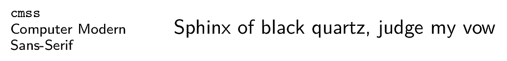
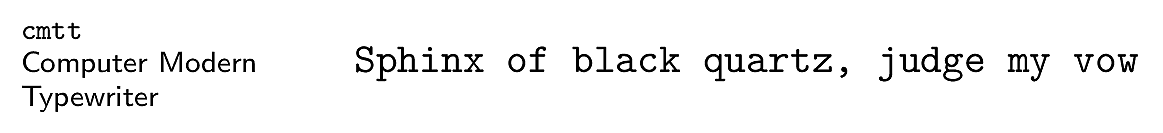
The three default types of font
At any given time, TEX expects there to be three
typefaces available: rm for Roman
(Serif), sf for Sans-Serif, and
tt for Typewriter (Monospace).
| Font family | Code |
| Roman (serif, with tails on the uprights),
the default | rm |
| Sans-serif, with no tails
on the uprights | sf |
| Monospace (fixed-width or
typewriter) | tt |
It is common to want to change all three defaults at
the same time in order for new fonts to match each other.
If a typeface provides Roman, Sans, and Monospace all in
its own style, the package will change all three defaults
automatically. Packages loading a single font family just
load that one, so the others would remain Computer Modern.
You can load another package for other fonts to replace
them, or specify them individually as shown in the rest of
this section.
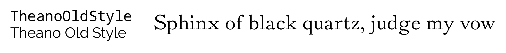
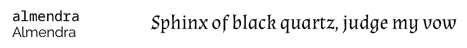
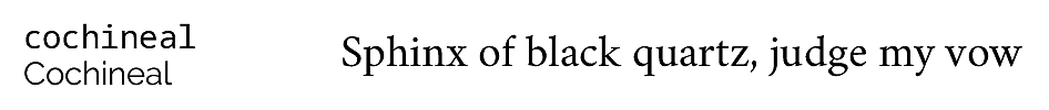
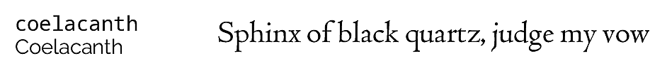
6.2.2.1 OpenType and TrueType typeface packages for LATEX
The list below shows the 60
or so packages for OTF and
TTF typefaces which are
installed with a full distribution of TEX. Because these
are packages, using one makes the
typeface immediately available, eg
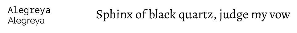
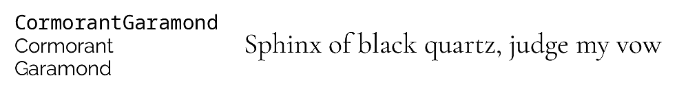
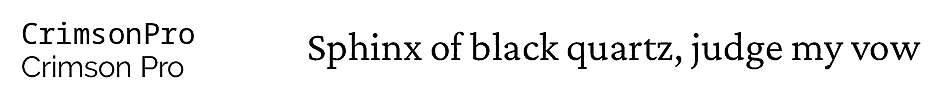
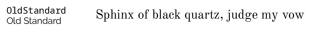
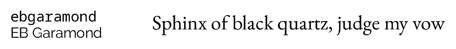
\usepackage{ebgaramond}will set the EB Garamond typeface as the default for
the document. For packages setting a sans-serif typeface
(not normally used as a default), there is usually a
default option which does it, eg
\usepackage{roboto}Many of these packages include many variants of the
typeface beyond the conventional roman, italic, bold, and
bold-italic: it’s important to read the package
documentation to find out what is available.
(Some specialist font packages are not included here
because they are not actually fonts in themselves, but
‘enabling’ packages which make
specific combinations available for special purposes, such
as the hep-font package for math
combinations for the High Energy Physics
community.)
Adobe
‘35’ font equivalents
LATEX also includes versions of the popular (some
would say overused) Adobe ‘35’
fonts which have been built into laser printers,
wordprocessors, PDF readers, printer
drivers, and most DTP systems since the
dawn of desktop publishing shortly after TEX was
written. I am listing them separately because they are
still much asked-after, although their popularity has
waned as wordprocessors now provide other typefaces.
Four of the most often-requested are available as
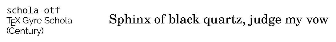
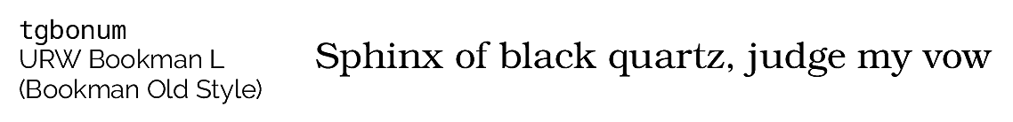
packages in the list above: Century Schoolbook
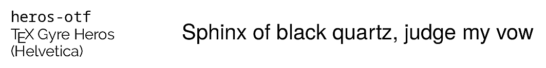
(schola-otf), Helvetica
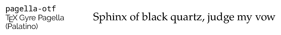
(heros-otf), Palatino
(pagella-otf), and Times New Roman
(termes-otf). The rest can be used
with the commands listed in Table 6.2 below.
The collection comprises six text typefaces (four
serif and two sans-serif, each in roman, italic, bold, and
bold-italic, making 32 fonts) plus one monospace, one
script, and one dingbats (35 fonts in total). For
copyright reasons they are now provided by
carefully-matched non-Adobe versions known as the
‘TEX Gyre’ collection, derived
from the equivalents generously donated by URW (Unternehmensberatung Rubow
Weber).
Table 6.2: The Adobe ‘35’ fonts
| TEX Gyre name | Original name | Adobe name | Package | Name for fontspec commands |
| Adventor | URW Gothic L | Avant Garde | | TeX Gyre Adventor |
| Bonum | URW Bookman L | Bookman Old Style | | TeX Gyre Bonum |
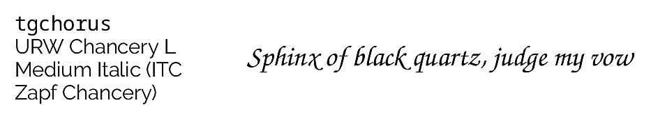
| Chorus | URW Chancery L | Zapf Chancery | | TeX Gyre Chorus |
| Cursor | URW Nimbus Mono | IBM Courier | | TeX Gyre Cursor |
| Heros | URW Nimbus Sans L | Helvetica | heros-otf | |
| Pagella | URW Palladio L | Palatino | pagella-otf | |
| Schola | URW Century Schoolbook L | Century Schoolbook | schola-otf | |
| Termes | URW Nimbus Roman No9 L | Times New Roman | termes-otf | |
| — | Pi Font | Zapf Dingbats | | See below |
The 35th font, Zapf Dingbats, is not included in the
TEX Gyre Collection, as it is now largely superseded by
LATEX’s own collection of symbols (see
(Pakin, 2009)) but the
bbding and marvosym
packages provide many replacements and
alternatives.
If you need the old Microsoft Symbol font, it can be
downloaded,
but Scott Pakin’s Comprehensive
LATEX Symbol List is probably a better place to
find symbols.
Original METAFONT fonts
The original Computer Modern typeface family was a
METAFONT design by Donald Knuth, and was accompanied by
a selection of other fonts, also made using METAFONT,
some of which are listed here. Many of these are now also
available in other formats.
Other donated fonts
The X Consortium donated a number of Latin-alphabet
fonts in Postscript Type 1 format: have a look at Charter,
Utopia, URW Antiqua Condensed, and URW Grotesk. There
are hundreds of other fonts downloadable from
CTAN: see Palle Jørgensen’s
comprehensive LATEX Font
Catalogue published by the Danish TEX Users
Group, categorised by type (serif, sans, monospace,
decorative, etc) with samples and links to the
packages.
Exercise 6.1 — Try some font packages
Experiment with changing your typeface.
Put a \usepackage command in your
document’s Preamble, and
retypeset it, for example:
\usepackage{Caladea}Notice how the typefaces are all different widths,
so the spacing and line-ends may change.
You can only use one of these packages at a time for
a class of font (serif, sans-serif, or monospace). Using
another of the same class just overrides the previous
one.
6.2.2.2 OpenType and TrueType fonts and faces by fontname
The fontname of a font is the
name that the designer declares is the name of the font
family (like Cabin), or sometimes the name of the
individual font (like Almendra-Bold). It is
not the filename, although sometimes
they happen to be the same. The fontname is the name you
see in lists of fonts like the font dialog drop-down
menu in editors.
You need the fontspec package to
use OT and TT faces
and fonts by fontname. This package provides three
commands to select font families:
\setmainfont (for the roman or main
face); \setsansfont (for the sans-serif
face); and \setmonofont (for the
typewriter or monospace face). These all take one
compulsory argument: the fontname of the font family or
typeface (we will see in § 6.2.2.3 below
how to do this with filenames).
You can find the fontnames of any of your installed
fonts by using your font browser or indexing command
provided by your operating system.
Exercise 6.2 — Try setting up fonts by fontname
Open a new LATEX file in your editor (pick a
blank or empty one if your editor offers
templates)
Copy and paste this text into the file:
\documentclass[12pt]{article}
\usepackage{fontspec}
\setmainfont{Crimson Pro}
\setsansfont{Cabin Regular}
\setmonofont{TeX Gyre Cursor}
\AtBeginDocument{\LARGE}
\begin{document}
This is the main (default) font

\sffamily This is the sans-serif font

\ttfamily This is the monospace font
\end{document}
Process the document and examine the
PDF. You may notice that the
sans-serif font (Cabin) and the monospace font
(Cursor)looks larger than the main font (Crimson),
even though they are all set to the
\LARGE size (about 18pt, see
Table 6.5 below). This is because fonts are
designed with different heights to the lowercase and
uppercase characters.
Compensate for this by adding the option
Scale=MatchLowercase to the sans
and mono commands:
\setsansfont{Cabin Regular}[Scale=MatchLowercase]
\setmonofont{TeX Gyre Cursor}[Scale=MatchLowercase]
Reprocess and see that the sans and mono fonts
have now been loaded at a size which matches the
main font
There are packages for four of the TEX Gyre
fonts, as noted in Table 6.2 above.
6.2.2.3 Setting OpenType and TrueType fonts and faces by
filename
This section is temporarily withdrawn
6.2.3 Changing the font-family temporarily
To use a different font [family] for a specific purpose,
use the command \newfontfamily. This works
exactly the same as the commands above for setting the main,
sans, and mono font families but takes an extra parameter
first, to specify the command you want it known by, so it
does not replace the Roman, Sand, or
Monospace defaults but is available in
addition to them. To make the command
\tablesfont invoke Liberation Sans
Narrow, for example, you would use:
\newfontfamily{\tablesfont}{Liberation Sans Narrow}Then the new command (here,
\tablesfont) can be used to switch to that
typeface.
To load a solitary font (that is, not a whole family),
there is a command \newfontface, which also
works in the same way, by creating a new command to switch
to it.
These commands created by
\newfontfamily, like the ones in Table 6.3 below, are called
‘unscoped’ because they have global
effect from that point on. In order to restrict the effect
to a smaller scope (a few words, for example), you
MUST put the command
and the text inside a
group (enclosed in curly braces as in
the example, or within an environment), otherwise they will
apply to the end of the document. See the sidebar ‘Grouping’ below for more detail.
In a normal document, of course, arbitrary typeface
changes like this are rare: people don’t (or at least,
probably shouldn’t) randomly flip from one font to another.
You select your default typefaces once, using packages or
commands, at the start of the document, and stick with
them — bold and italics are handled by the document class or
stylesheet packages you use.
However, in advertising or magazines, a wide range of
typefaces changes is common, but they are usually part of
predefined styles for handling that type of formatting,
built into the document class, so it is rare to have to do
them manually.
Most cases where people want unusual typeface
changes involve things like special symbols or effects on a
repetitive basis, and LATEX provides much easier
(programmable) ways to make these changes into shorthand
commands (called macros: see Chapter 7 ‘Programmability’ below).
This is jumping ahead a bit, but you could, for example,
define a new macro called \product which
would let you typeset product names in a distinct typeface
(usually italics):
Andlinger, Inc., has replaced \product{Splosh} with
\product{SuperSplosh}.
This is one of LATEX’s most powerful features.
It means that if you needed to change your
\product command at some later stage to
use a different font, you only have to change
the font-family name in the macro, and
you don’t need to edit your document text at all.
What’s more, a macro could do other things at the same time,
like add an entry to an index of products.
Vastly more common are changes to type
style, while staying within the same
font-family.
6.2.4 Changing type style
Within each typeface or font family there are usually
several different ‘looks’ to the type
design. LATEX distinguishes mainly between font shape and font series.
Italics is a shape (look carefully: the
actual shape of the letters changes, as well as their
slope); whereas bold is a series
(same shapes, same slope, just thicker strokes).
Beware of pushing your fonts beyond their limits unless you
have typographic skills. It is not normally meaningful to combine
one shape or series class with another of the same class,
such as trying to get slanted-italics. It’s also sometimes
impossible to combine one family with another (such as
seriffed sans-serif type!). Slanted plus italics, for
example, doesn’t make any sense, as italics are already
slanted; and while some typefaces may well possess
sans-serif italic
small caps, they are not in common use.
If you really feel you need such combinations, try the
fontaxes package, which splits the
‘shape’ axis into a primary axis
(upright, italic, slanted, upright italic, etc) and a
secondary axis (small caps on or off). It redefines the
\itshape and \scshape
commands to combine instead of override each other. The
fontspec package loads
fontaxes. So do many legacy font
packages. (Thanks to
@Davislor on
https://tex.stackexchange.com/questions/555175/combining-caps-text-and-italics/555184#555184 for this information.)
Sans-serif and
monospace (typewriter) are not just different fonts, they
are often different typeface families entirely.
To avoid the problem of forgetting to put curly braces
around the commands and text you want
formatted, there is an alternative set of
scoped commands for the most common
type shape and series commands. These use curly braces in
the ‘argument’ manner, so their
effect applies only to the text in curly braces. These are
the normal commands for changing the style of a word or
phrase.
Table 6.4: Typeface styles, families, shapes, and series
(scoped)
| Type style | Command | Example (using Computer
Modern) |
| Italic | \textit{text} | puts text into
italics |
| Slanted | \textsl{text} | puts text into
slanted type* |
| Small Capitals | \textsc{text} | puts TEXT into
small caps |
| Bold | \textbf{text} | puts text into
bold type |
| Sans-serif | \textsf{text} | puts text
into sans-serif type |
| Monospace | \texttt{text} | puts text
into typewriter type |
These are commutative too, so you can nest them inside
one another:
...\textbf{bold \itshape{italic \textsf{sans-serif}}} type...What we know as
underlining isn’t a font: it was used
in the days of
typewriters where italics were not available, and
it is extremely rare in typography except for specialist
purposes. If you think you need it, use the
ulem package with the
normalem option, which provides a
\uline command.
6.2.5 Font sizes
LATEX has built into its defaults a set of predefined
font size steps corresponding more or less to the
traditional sizes available to metal typesetters. This is
deliberate, as these sizes have grown up over 500 years of
experience in printing as those which go best together for
book-work, which is where TEX originated.
Table 6.5: LATEX font step sizes
| Command | Example | Nominal point size | Exact point size |
| \tiny | The quick brown fox
jumps over the lazy dog | 5 | 5 |
| \scriptsize | The quick brown
fox jumps over the lazy dog | 7 | 7 |
| \footnotesize | The quick
brown fox jumps over the lazy dog | 8 | 8 |
| \small | The quick brown fox
jumps over the lazy dog | 9 | 9 |
| \normalsize | The quick
brown fox jumps over the lazy dog | 10 | 10 |
| \large | The quick brown fox
jumps over the lazy dog | 12 | 12 |
| \Large | The quick brown fox
jumps over the lazy dog | 14 | 14.40 |
| \LARGE | The quick brown
fox jumps over the lazy dog | 18 | 17.28 |
| \huge | The quick
brown fox jumps over the lazy dog | 20 | 20.74 |
|
\Huge | The quick
brown fox jumps over the lazy dog | 24 | 24.88 |
• Note that these are
unscoped commands (see the sidebar ‘Scope and style’ above), so they
should be used inside a group, either an environment
or a set of curly braces terminated with a
\par inside the closing brace. There
are no scoped equivalents of these commands.
• Mathematics users should not
confuse the text-mode \scriptsize
command here with mathematics-mode
\scriptstyle. [Thanks to
Doug McKenna and
David Carlisle on the TEXhax mailing
list.]
These sizes are also reflected in the size
steps at which Computer Modern was designed in
the METAFONT program. It often comes as a surprise to new
users that many typefaces are not designed as a single font
and just scaled up or down, but specially drawn at different
sizes to make them more legible.
As an example,  , and
, and  ,
and
,
and  so you can see there really
is a significant difference.
so you can see there really
is a significant difference.
Modern type
formats have hinting parameters that
allow scaling to implement the effects of design-sizes,
but in general, you probably don’t want to go scaling
fonts too far beyond their design size because the spacing
will start to look very odd.
The default sizes (and the commands that operate
them) are based on the use of a 10pt font, which is the
default size for book work.
Using the larger document class options (11pt and
12pt) will use 11pt and 12pt designs (explicit or
hinted), with the other sizes (such as for headings)
rescaled to match.
The exact sizes used are listed in the macros in the
Class Option files size10.clo,
size11.clo and
size12.clo.
LATEX’s default fonts above 10pt are in fact
scaled by a factor of 1.2, as shown in the fourth column
of Table 6.5 above.
While these shorthand commands relieve the beginner of
having to worry about the appropriate point-size
for a given task, if you need very specific sizes you
can use the \fontsize command to specify
exact sizes. This takes two arguments: the point size and
the baseline distance. The example below gives you 22pt type
on a 28pt baseline (ie with 6pt extra space or
‘leading’ between the lines).
The term ‘leading’ comes from the old metal-type
practice of adding a strip of typemetal between the lines,
or casting the type on a deeper body, to increase the line
spacing, so it’s pronounced ‘ledding’ after the
metal.
To override the fixed font-step sizes
(the ones in Table 6.5 above) it used to be
necessary to precede your
\documentclass with
\RequirePackage{fix-cm} but this is no
longer needed: you can use the
anyfontsize package in the normal way
instead:
% \RequirePackage{fix-cm} % no longer needed
\documentclass{article}
\usepackage{fontspec,anyfontsize}
...
6.2.6 Logical markup
All this playing around with fonts is very pretty but
you normally only do it for a reason, even if that reason is
just to be decorative. Italics, for example, are used for
many things:
| Cause | Effect |
| Foreign words | ex
officio |
| Scientific names | Ranunculus
ficaria |
| Emphasis | must not |
| Titles of documents | Accounting in Business |
| Product names | Corel
WordPerfect |
| Variables in maths | E=mc² |
| Subtitles or headings | 42. How to get
started |
| Use of a letter as a word | Who knocked the L out of
London? |
| Decoration | FREE UPGRADE!!! |
| Distinction/particularisation | [eg a whole paragraph to set it apart] |
| editorial intervention | [correction, elision, abbreviation, citation,
interpolation, etc] |
Humans usually have no problem telling the difference
between these reasons, because they can read and understand
the meaning and context, and we’ve been exposed to many of
these meanings since we started to read. Computers cannot
(yet) do this reliably, so it has become conventional to use
descriptive names which make the distinction explicit, even
though the appearance may be the same.
LATEX has some of these built in, like
\emph, which provides
emphasis. This has a special feature
because when the surrounding text is
already italic, emphasis
automatically reverts to upright
type, which is the normal practice
in typesetting.
This has a special feature because {\itshape when
the surrounding text is already italic,
\emph{emphasis} automatically reverts to
\emph{upright type}}, which is the normal practice
in typesetting.
This sensitivity to logic is programmed into
the definition of \emph and it’s not
hard to make up other commands of your own which could do
the same, such as \foreign or
\product.
But why would you bother? In a short document it’s
probably not important, but if you’re writing a long
report, or a formal document like an article, a book, or a
thesis, it makes writing and editing hugely easier if you
can control whole groups of special effects with a single
command, such as italicising, indexing, or cross-referencing
to a glossary. If a format needs changing, you only have to
change the definition, and every occurrence automatically
follows suit.
A warning from the past
Beware of this ‘vaine conceipt of simple men,
which judge things by ther effects, and not by ther
causes’. (Edmund Spenser, 1633)
It’s hugely more efficient and productive to have
control of the cause than the effect.
It also makes it possible to find and act on groups of
meanings — such as making an index of scientific names,
or retrieving all product names — if they are identified
as such. Otherwise you’d spend weeks hunting manually
through every \textit command to find the
ones you wanted. This is the bottom line of automation: it
can save you time and money.
In Chapter 7 ‘Programmability’ below we will see how to make your
own simple commands to do things like this.
6.2.7 Colour
You can typeset anything in LATEX in any colour you
want using the xcolor package. Adding the
command \usepackage{xcolor} to your Preamble (note the
US spelling of color) makes available a
default palette of primary colours: red, green, and blue for the RGB colour model used for emitted light
(computer and television screens), and cyan, magenta, yellow, and black for the
CMYK colour model used for reflected
light (printing).
Warning
This package supersedes the old
color package, which
SHOULD NOT be used, as
everything it did is now done by
xcolor.
For the occasional word or phrase in colour, use the
command \textcolor with two arguments, the
colour name and the text: \textcolor{red}{like this} to get red
like this. There is an
unscoped \color command as well, for use
within groups:
...{\color{blue}some text in blue}...There are several package options for additional
colours: two popular ones are dvipsnames,
which provides a 64-colour palette of predefined colour
names exactly matching the big box of 64
Crayola™ colouring pencils
much favoured by artists and designers; and
svgnames, which provides the 256 colours
defined in the specification for the Scalable Vector Graphics (SVG) drawing
and diagramming language (which includes the 64 colours
of dvipsnames). There are others too: see the
documentation for the xcolor
package.
If you want the Crayola
colour Crimson, and you have loaded
xcolor with the svgnames or
dvipsnames option, you can use it as a
colour name (colour names are case-sensitive):
{\color{Crimson}some red text}
\textcolor{Crimson}{some red text}
As some of the predefined
colour names are quite long, you can create a short name of
your own for colours you use frequently, using the
\definecolor command:
\definecolor{mb}{named}{MidnightBlue}The \definecolor command needs three
arguments: your shorthand name, the name of the colour
model, and the colour specification. In the case of the
named model, the last argument is one of
the colour names specified by the named option you loaded the
package with.
Using the \definecolor command, you
can also define any colour you want by giving it a name,
specifying which colour model, and providing the Red-Green-Blue (RGB) or Cyan-Magenta-Yellow-Black (CMYK) colour
values expressed as decimal fractions of 255,
separated by commas. For example, an
RGB colour given as (37,125,224) in
decimal integer form can be given as:
\definecolor{midblue}{rgb}{0.145,0.490,0.882}To get the fractional value, divide the integer
value by 255, the maximum for each of the hues in the
Red-Green-Blue colour model. You can then use
\textcolor with your new colour name:
midblue looks like this if
you’re reading in colour. Alternatively, use the
HTML hexadecimal colour model, the same
as used in web pages and CSS stylesheets:
\definecolor{midblue}{HTML}{250FE0}The xcolor package also provides
two colour versions of \fbox (see § 4.6.2 above) called
\colorbox and \fcolorbox
which create a box with a coloured background:
\colorbox{midblue}{\color{magenta}Magenta on midblue}The material in the second argument can have its own
text colour, as in the example. The
\fcolorbox has an extra first argument to
specify the colour of the frame or border placed around the
box. The border width is controlled by the \fboxrule setting and the
separation between rule and content is controlled by the
\fboxsep setting as we
already saw in § 4.6.2 above.
However, combining colours is an art and a skill: using
the command above to get the effect magenta on midblue illustrates why
it is important to learn about colour models and palettes
before trying to use them!